Games UX/UI
6+ years’ experience
As Senior UX Designer at DoubleDown, I formed the UX team during a significant studio expansion, leading UX production on our flagship service-based title Spinning in Space and contributing to 10+ blue-sky concepts and prototypes for review by our executive leadership in Korea.
Spinning in Space
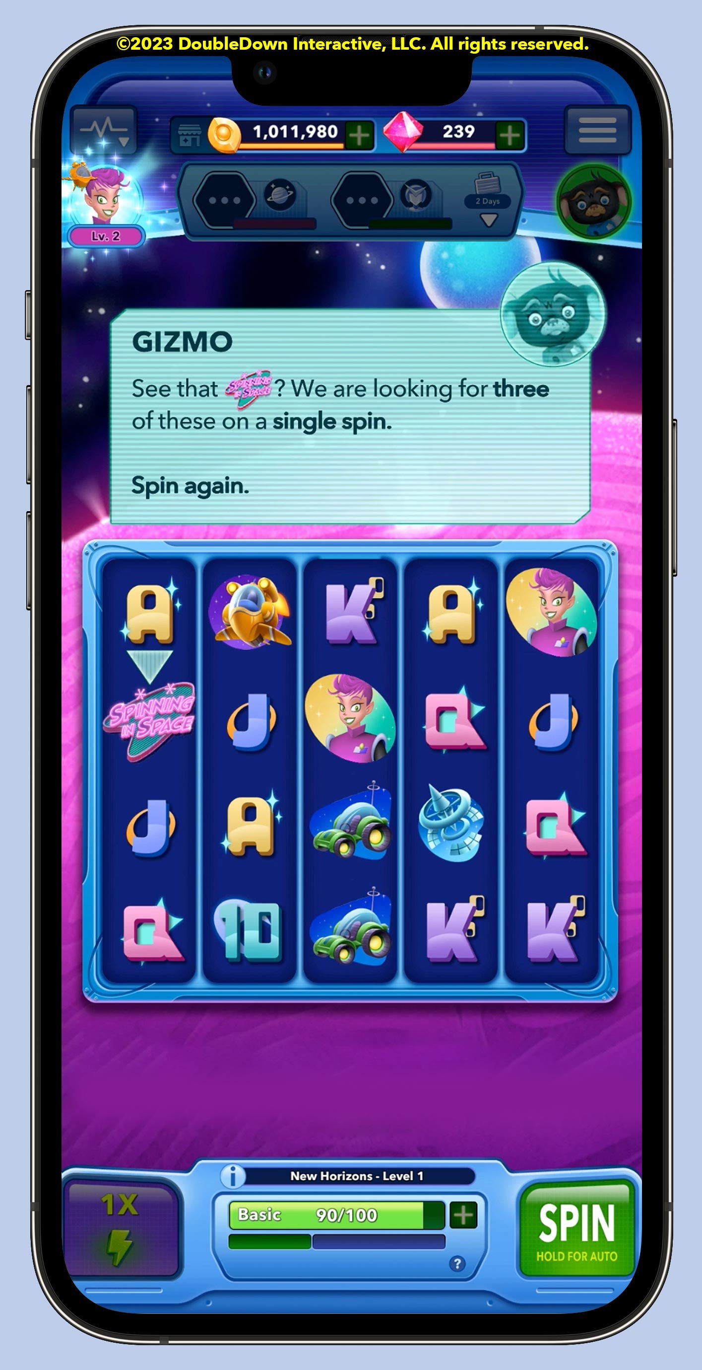
Spinning in Space is a sweeping, retro-styled space adventure game exploring a whimsical galaxy filled with (many!) dozens of characters and interweaving plot lines spread across five distinct planets.
I led UX across most of the production lifecycle through public open beta, when the project was canceled. I am particularly proud of the modular UX design system I created to unify the player experience across the app’s many features and gameplay modes.
UX lead for a fully-produced mobile game
Thoughtfully integrating a feature
Avoiding the “tacked-on feature” blues
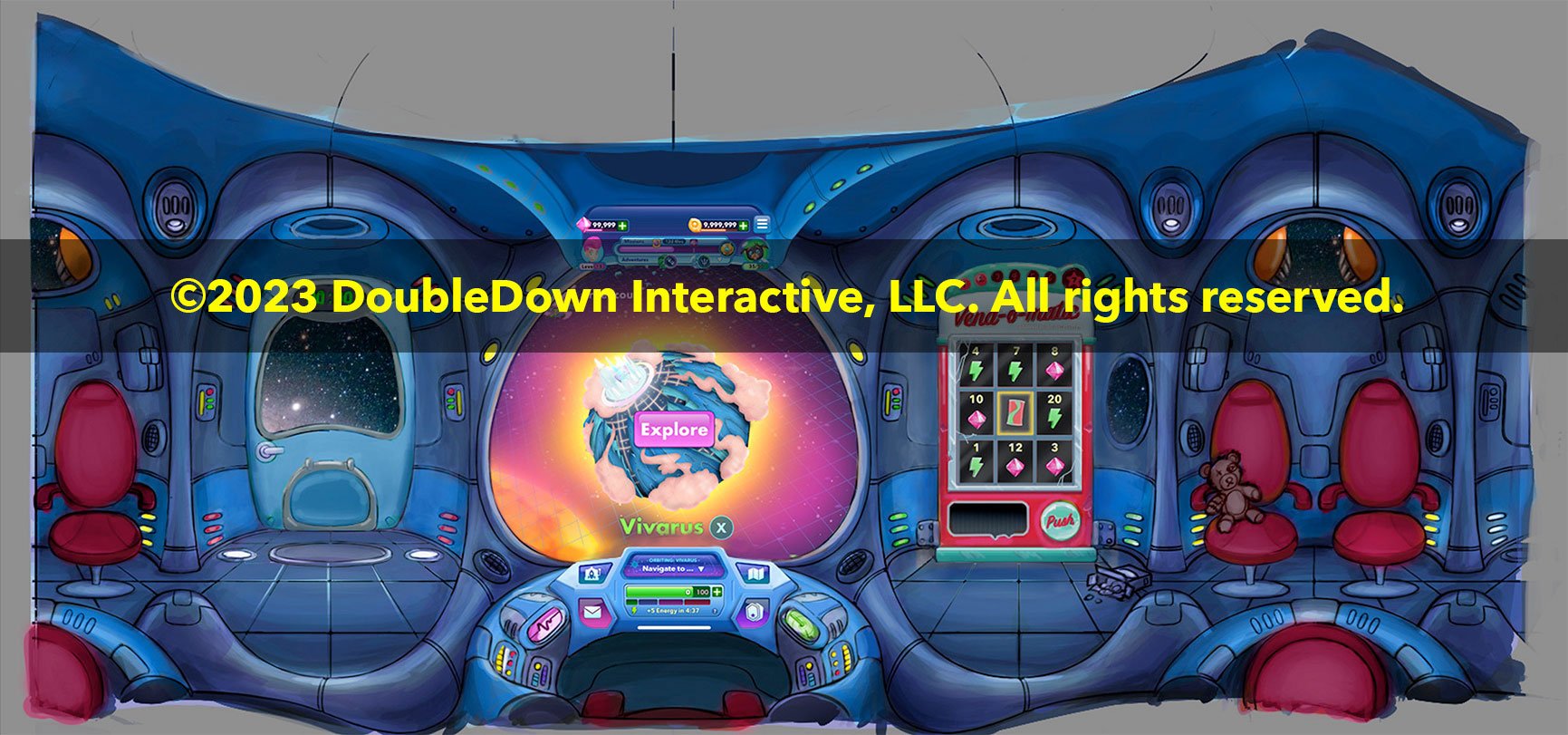
The result: An expanded “ship’s cockpit” with a fun, light interaction that appears only when needed and extends our players’ world.
NEED
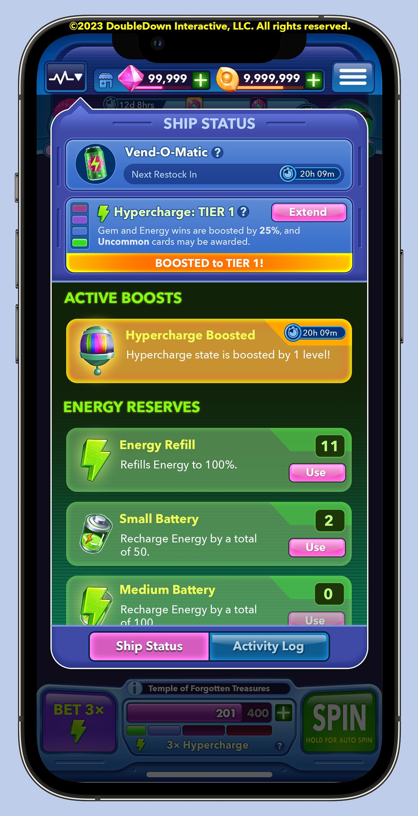
Our Product team requested a feature to encourage retention by daily offering the player free Energy for continued play. Design guidelines also necessitated a diegetic, in-world approach with a simple, feel-good interaction.
SOLUTION
Collaborating with game designers and UI artists, we settled on a wheel spin skinned as an in-world retro vending machine. I was responsible for integrating this experience with established rhythms of play. Features like this are too often added as an afterthought, creating unhelpful friction in the path to fun. I sought a solution that would:
feel like an organic extension of the existing UI and player experience
limit clutter on the game’s lobby screen, calling attention only when necessary
support larger creative goals of furthering the player’s sense of place in our galaxy.
The result: An expanded “ship’s cockpit” fun, light interaction that extends our world. (The constantly-breaking vending machine later became a running gag in tutorials and character dialogues!)
Sometimes video says it best
Concise narrated video “explainers” are helpful in communicating UX vision for interaction design to our Animation and Engineering teams. Translated captioning make these videos useful for international communication with our Korean teams as well.
A narrated animatic I created for my team to demonstrate implementation. (1:16; audio on)
Screen recording of final Daily Bonus experience in-engine during gameplay. (0:15; no audio)
Prototyping interactions
DoubleDown’s prototyping studio was set up to rapidly conceptualize and prototype game ideas across genres.
Many of these were fully-fledged Unity prototypes created by our technical artists — but the UX team often produced lower-fidelity interactive wireframes, animatics, or prototypes to explore ideas even more quickly and at low cost.
©2023 DoubleDown Interactive, LLC. All rights reserved.
rapid experimentation for games and features
Ian Smith
Game Design Manager, DoubleDown Interactive
“[Jason’s] passion for a wide variety of games and the deep thinking he has done about the nature of play is evident in both his designs and in collaborative discussions … I cannot overstate how vital Jason has been as a patient and persuasive communicator advocating on behalf of the breadth of players that will play our game.”
Bot Land
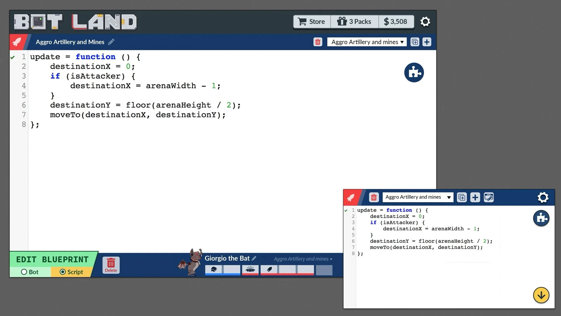
I designed the UX/UI and managed creative for this bot battler, including hiring a team of a half-dozen illustrators and animators and guiding them through concepting and production. The game was shipped in 2019 desktop and iOS/Android, requiring thoughtful UX across a wide range of screen sizes.
UX/UI/art direction for a strategy game
Designing customizable Bots
Bots needed to be expressive, while also fitting comfortably within the arena’s grid. I designed a customization system and a production process that allowed the artists to push compositions as far as possible — without breaking anything.
Ryanne Levin
Bot Land illustrator and animator


