Product/UX Design
10+ years’ experience
Across a decade working for the ITS Enterprise Information Services team at a state university, I designed dozens of custom enterprise applications serving NAU’s 30,000+ students, staff, and faculty.
I also founded and led the institution’s Experience Design and Research team, taking on Design Ops, Team Management, and Product Management roles.
NAU website redesign
NAU’s sprawling public website had grown organically across decades, serving a range of audiences with distinct needs: students (27k+), faculty & staff (3k+), parents, researchers, Lumberjacks fans, auditors, and alums, to name but a few. Following a 2018 brand refresh, leadership requested a new top-level home site redesign focused primarily on welcoming future students.
I advocated for a deeper sitewide redesign, addressing longstanding UX and structural issues with navigation and consistency across the 185k+ pages of the institution’s marketing, academic, and business subsites. Across the next 2 years, I took the role of Product Manager and UX Design Lead, reporting to executive leadership and presenting to the President. The redesign launched in 2021, and is still in use today.
Key “Request For Information” conversions immediately increased 12%. Fifteen months out, RFI traffic from the new site was up 41.2% year-over-year.
product management for an institutional website
Discovery
Audience mapping
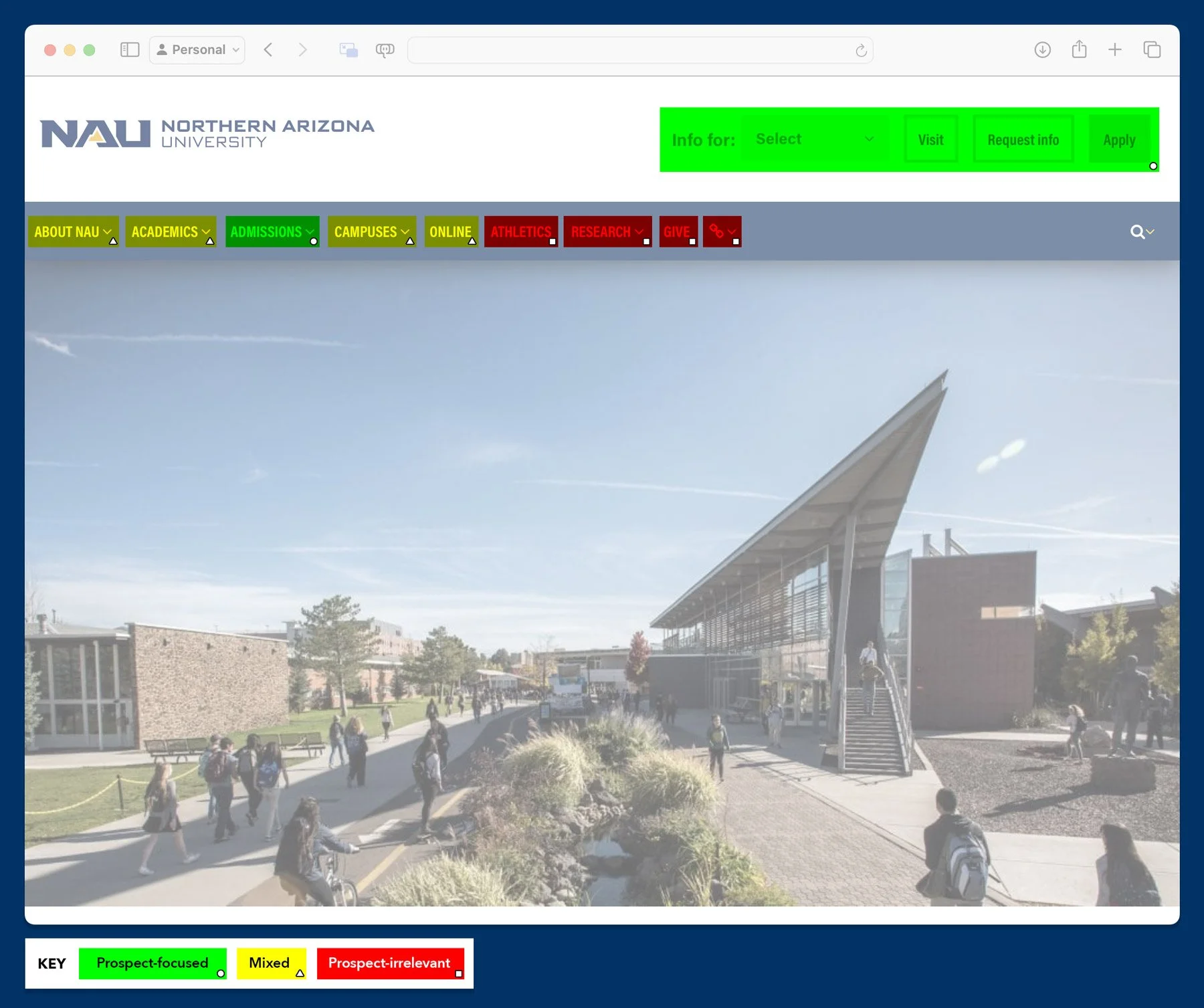
I wanted to start with a clear understanding of our current state: who were our visitors, and what were they looking for? I gathered our team to categorize the current site’s content and navigation by audience.
OBSERVATIONS
Few navigation items aligned directly with the motivations of prospective students
Menus grouped information according to institutional politics rather than by audience
User testing
The first usability tests I set up asked participants to work toward a single, open-ended task: “This is the NAU home page. Find a degree program that interests you and begin the process of applying.”
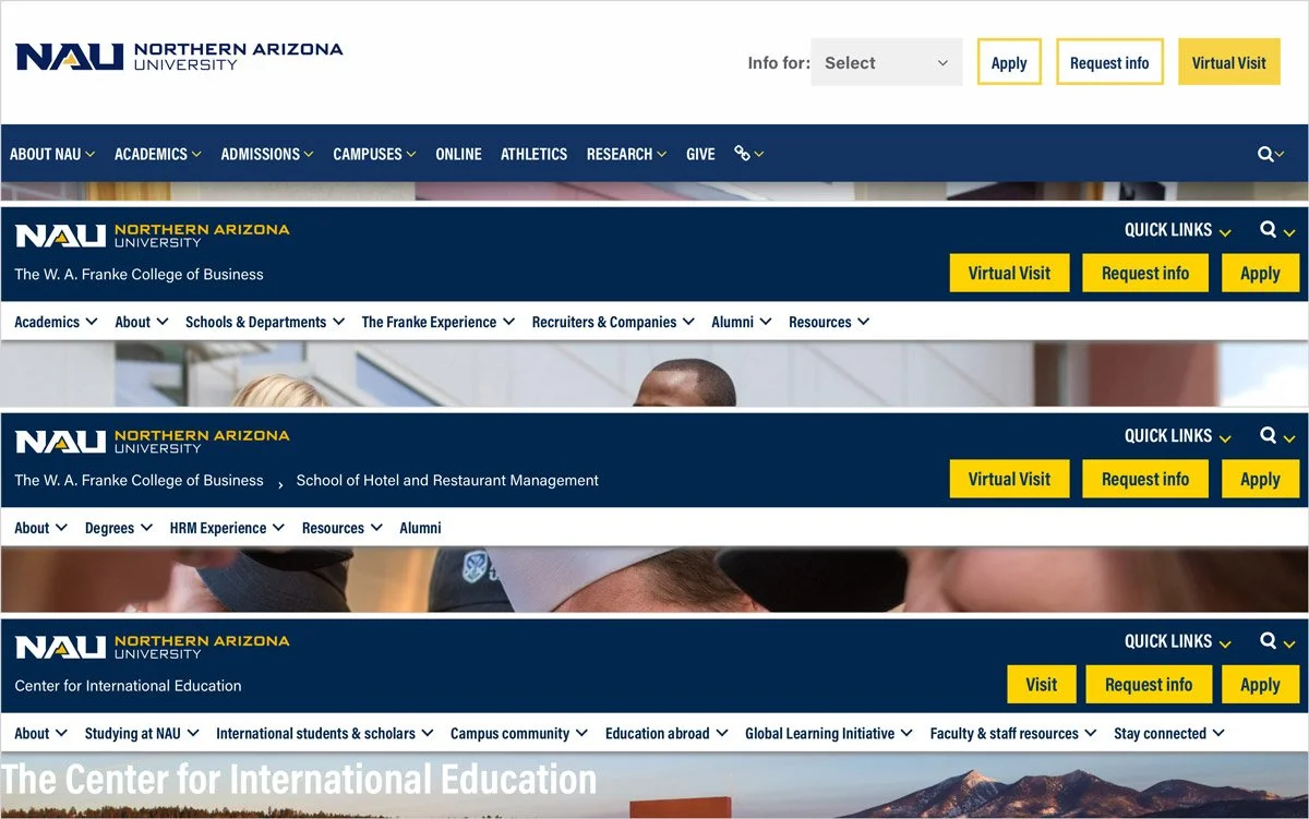
In their search for an online nursing degree, one participant was required to visit 6 different sites, each with a different menu structure, in order to find all the information they needed before applying!
This presentation slide viscerally illustrates this guest’s journey to apply. It played a key role in gaining executive support for the project!
Advocating for the guest
Based on my team’s research findings, I presented to the University President, making the case for a deeper holistic redesign.
A large ask — but I demonstrated how the work could build on previous technical, design, and marketing accomplishments by our teams, and how it would benefit enrollment numbers through improving the guest experience.
I was given the green light!
Design
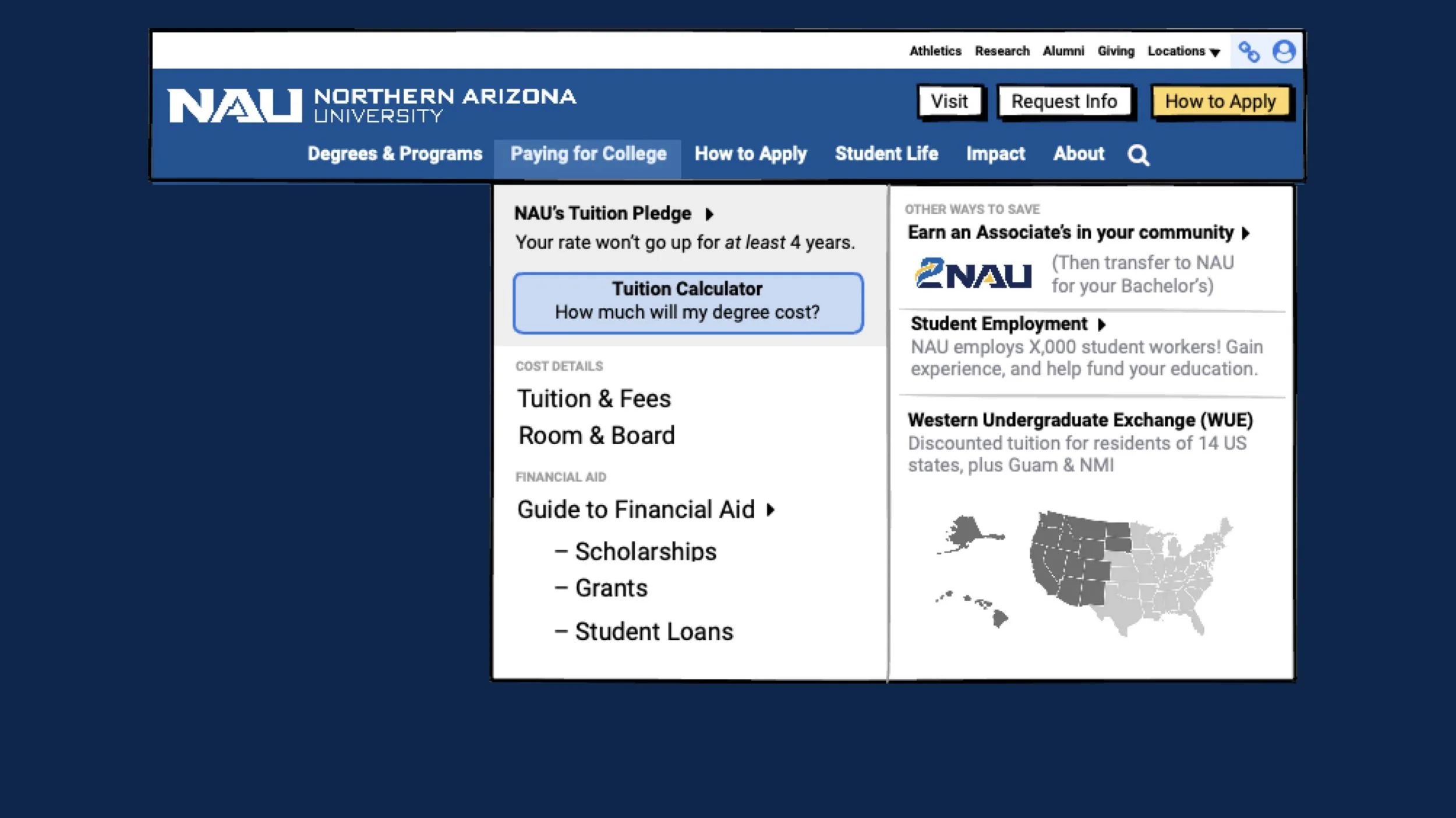
Human-centered navigation design
I proposed a new structure based on research findings about key motivations of prospective students:
Degrees & Programs
“Can NAU help me aspire to my dreams?”Paying for College
“Is this future possible for me?”How to Apply
“Alright! Let’s do this.”Student Life
“What would my life look like at NAU?”Impact
“Is NAU worth committing to?”About
“Who is NAU (in its own words?)”
Words matter!
Great hosts are keenly aware of the needs of their guests — but the microcopy on the existing site betrayed a focus on institutional priorities rather than human ones.
Consider “Admissions”: a university has an Admissions Office because the institution needs to be selective about whom they shall admit.
A future student sees the question from the other side: “How can I apply?”
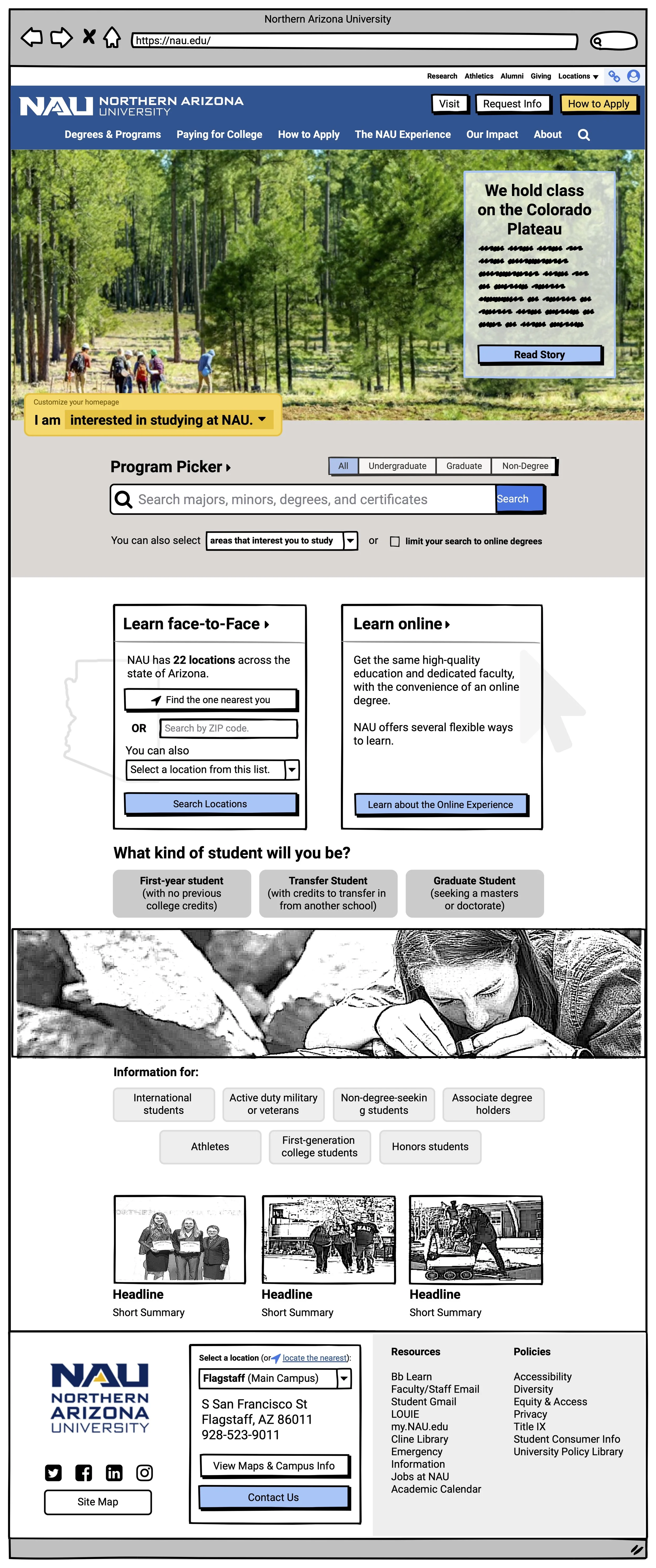
Change management via wireframes
Getting the sitemap approved was a challenge — many stakeholders feared that their interests wouldn’t be represented.
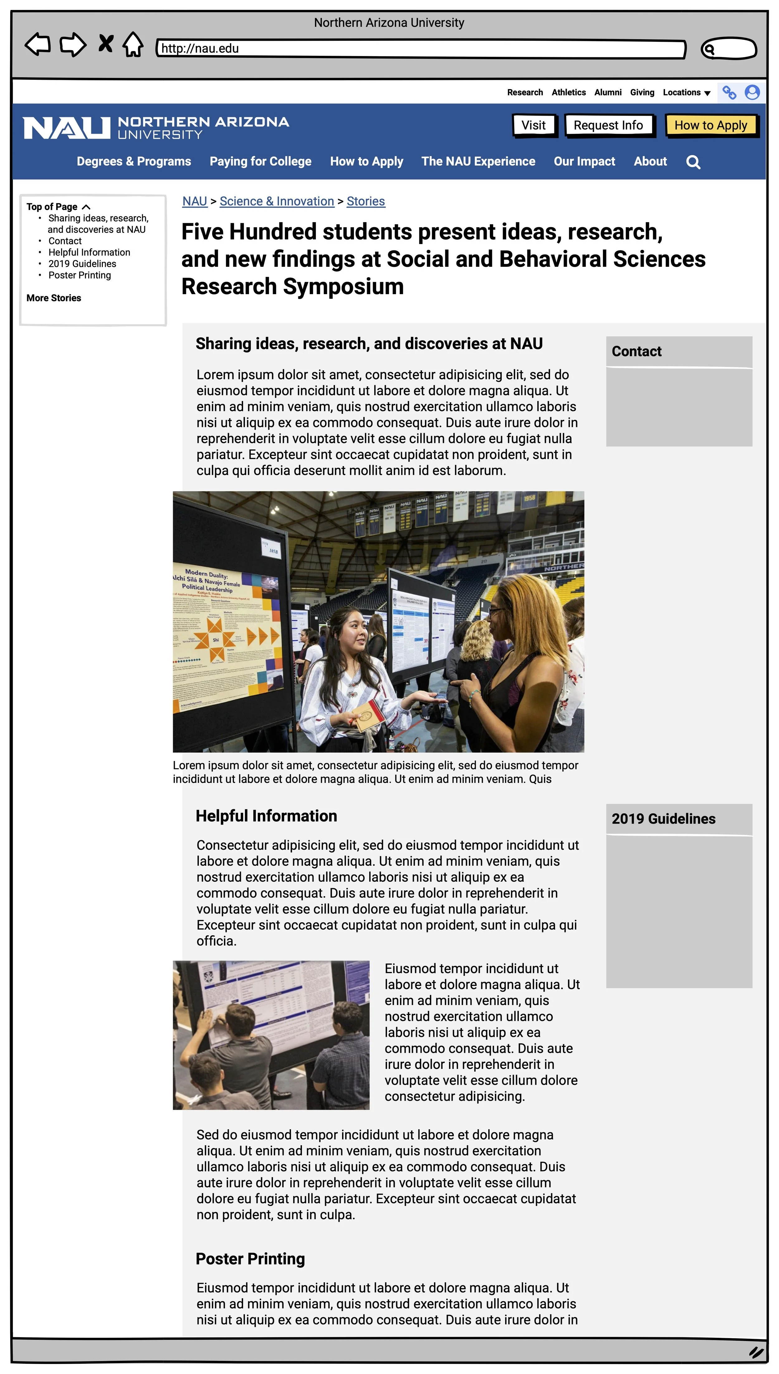
My certification in Change Management came in handy: I created a clickable content-focused wireframe flow helping leadership envision how visitors would receive contextual information at just the right time in their journey.
Design system & visual design
Based on my wireframes, our brand partners Lipman Hearne provided a visual design direction for the site
From these foundational documents, I built a design system, including a web development color system and atomic design component library.
From here, I created responsive design comps for key pages and delegated work across my team to generate development documentation for 40+ page designs that made up the marketing site.
Delivery
Outcomes
Traffic to our “Request For Information” pages was a key metric for the redesign.
After the site launched, RFI conversions immediately increased by 12%.
Fifteen months from launch, RFI traffic from the new site was up 41.2% year-over-year.
Using a CMS we developed, University Marketing was able to change degree marketing information within minutes rather than weeks, giving them the ability to respond to market trends.
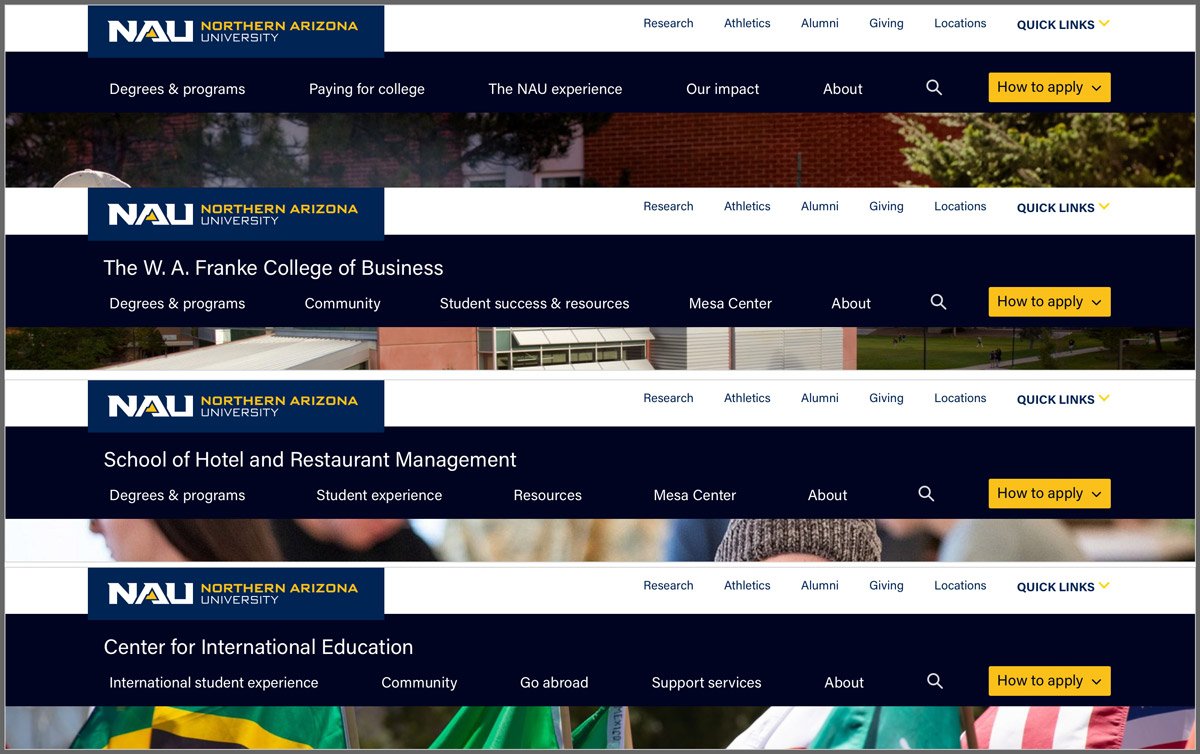
Sitewide navigation
A research institute has a very different audience and priorities than a residential dining hall, or a college of engineering, or the office of the Ombuds. These subsites needed a balance of structure and individual expression.
Building on the Marketing navigation used on the home site, I established IA guidelines for academic departments and business units.
⬇
Ann Marie deWees
Associate Vice President of Marketing at NAU

