Spinning in Space
Case studies in UX production for a space adventure game
RIGHTS NOTICE
Our team was laid off in September 2023, but given permission to show work from some unreleased projects for portfolio purposes:
[We] understand that examples of work are commonly shown when looking for employment, etc. Therefore, if you intend to show … artwork [created at DoubleDown], it is your responsibility to put the copyright information with the image.
All work shown on this page is © 2023 DoubleDown Interactive, LLC. All rights reserved.
Spinning in Space
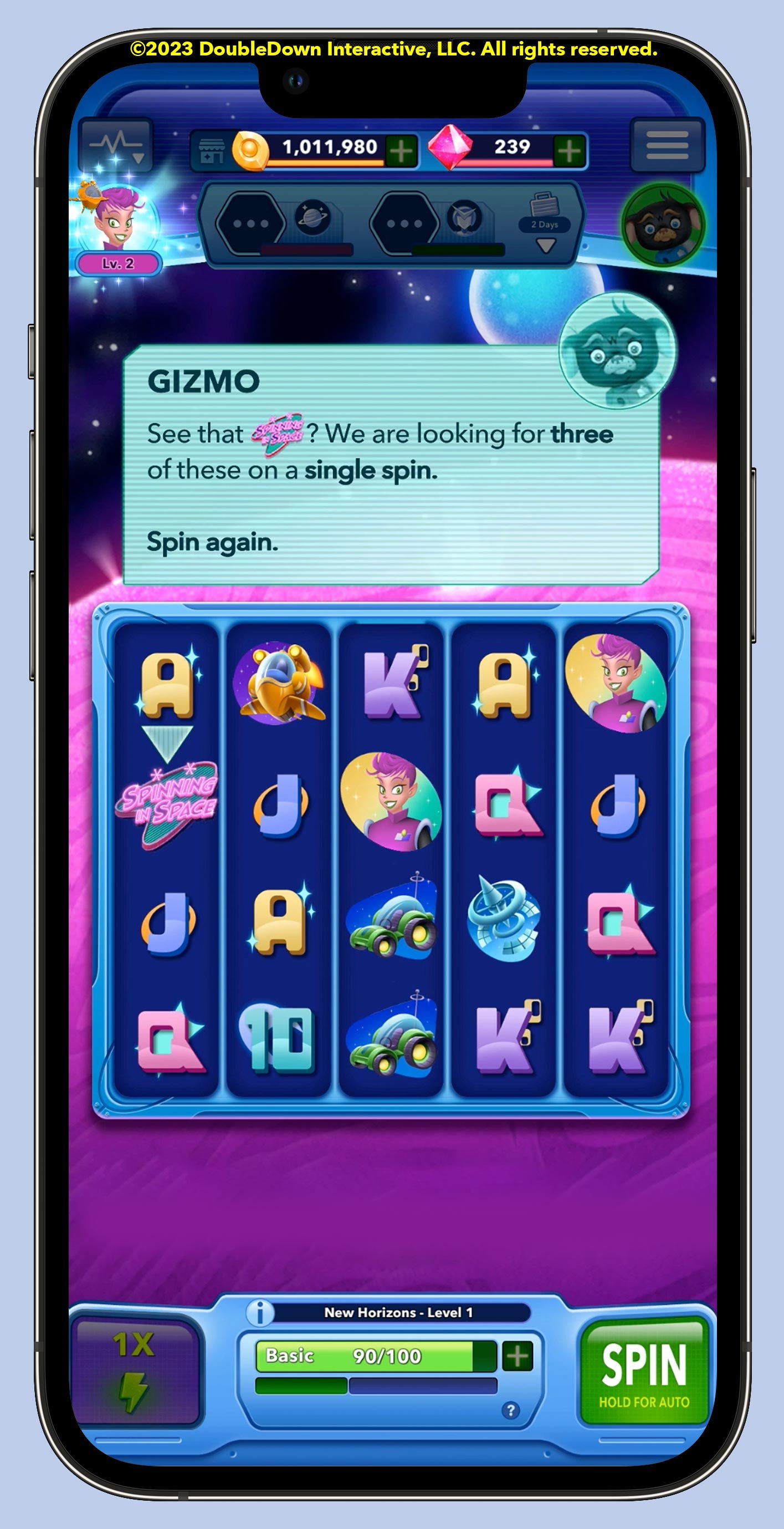
Spinning in Space is a sweeping, retro-styled space adventure game exploring a whimsical galaxy filled with (many!) dozens of characters and interweaving plot lines spread across five distinct planets.
I led UX across most of the production lifecycle through public open beta, when the project was canceled. I am particularly proud of the modular UX design system I created to unify the player experience across the app’s many features and gameplay modes.
UX lead for a fully-produced mobile game


Thoughtfully integrating a feature
Avoiding the “tacked-on feature” blues
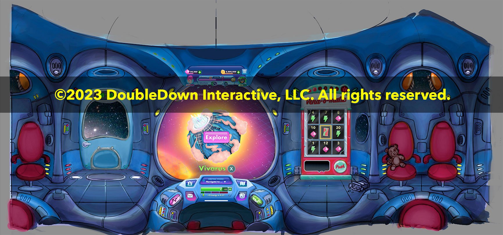
The result: An expanded “ship’s cockpit” with a fun, light interaction that appears only when needed and extends our players’ world.
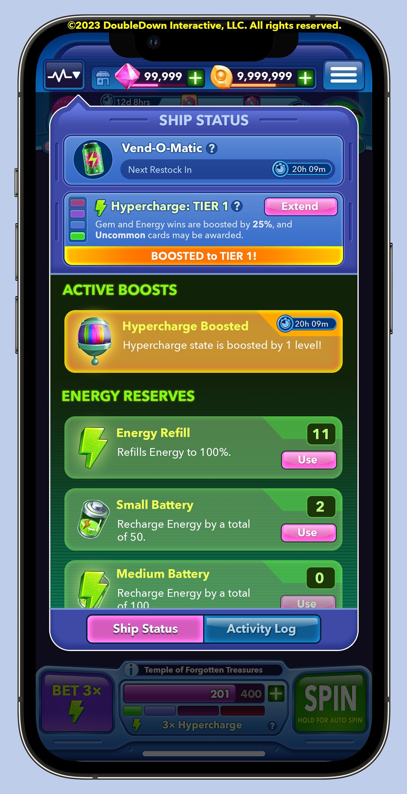
NEED
Our Product team requested a feature to encourage retention by daily offering the player free Energy for continued play. Design guidelines also necessitated a diegetic, in-world approach with a simple, feel-good interaction.
SOLUTION
Collaborating with game designers and UI artists, we settled on a wheel spin skinned as an in-world retro vending machine. I was responsible for integrating this experience with established rhythms of play. Features like this are too often added as an afterthought, creating unhelpful friction in the path to fun. I sought a solution that would:
feel like an organic extension of the existing UI and player experience
limit clutter on the game’s lobby screen, calling attention only when necessary
support larger creative goals of furthering the player’s sense of place in our galaxy.
The result: An expanded “ship’s cockpit” fun, light interaction that extends our world. (The constantly-breaking vending machine later became a running gag in tutorials and character dialogues!)
Sometimes video says it best
Concise narrated video “explainers” are helpful in communicating UX vision for interaction design to our Animation and Engineering teams. Translated captioning make these videos useful for international communication with our Korean teams as well.
A narrated animatic I created for my team to demonstrate implementation. (1:16; audio on)
Screen recording of final Daily Bonus experience in-engine during gameplay. (0:15; no audio)

My initial sketch exploring how the existing UI could be extended to create a spatial cockpit.

My comp: "Bonus available!"

Testing the concept with UI artists.
Environment artists draft the space in perspective.
Improving the reading experience
Holistic problem solving
Thoughtful experience design requires big-picture synthesis across disciplines and teams. I coordinated the efforts of UI artists, animators, and writers to improve our reading experience.
NEED
Internal usability testing showed the reading experience of our character dialogues to be sub-optimal. As a relatively text-heavy narrative adventure game, Spinning in Space needs fantastic readability!
SOLUTION
I identified a set of three approaches which, combined, would improve ease of reading:
Provide typographic guidance to UI artists for improved text legibility
Adjust motion design applied to character dialogs
Establish writing guidelines, shortening text and adding visual/structural formatting
The result: a cleaner, more comfortable reading experience for the player who likes to read (and better “SKIP” options for the player who doesn’t!)

Motion and interaction design
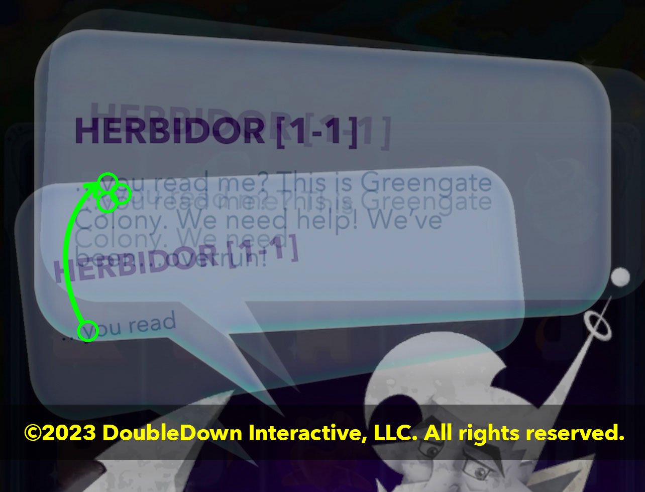
Small issues in our dialog engine compounded to make reading more difficult than necessary. I highlighted several improvements, which our animator handled beautifully:
Once text begins to flow in, its position on screen should remain fixed.
Speech bubbles need only animate when a character transitions onto (or off of) the screen.
Text can appear more quickly, advancing instantly in response to user input.
Multiple statements in a row by the same character should trigger the speech bubble to resize accordingly.
Original dialog engine. Unnecessary animation adds reading friction. (0:10; no audio)
Our animator used my guidelines to create a more elegant experience that prioritizes readability. (0:14; no audio)

Shorter bits of larger text, spacious design, and a simplified UI improve readability.

Thoughtful use of structured text (strong and emphasized elements; generous spacing) make player actions more clear.

Text in an animated parent container.
Distracting motion applied to text fields.
Brian Porterfield
Senior Art Manager, DoubleDown Interactive
“[Jason was] able to adeptly … manage a complex UX system across studios and bring a cohesive … vision to [Spinning in Space]. His patient, inspired, clear communication style … makes him extremely effective at handling the complexities of UX with regards to the other teams, departments, and studios.”